Pages

Friday, April 10, 2015

Book Review: The Illustrated Encyclopedia of Feng Shui by by Lillian Too


http://www.amazon.com/The-Illustrated-Encyclopedia-Feng-Shui/dp/1862045968
http://www.goodreads.com/book/show/1496971.The_Illustrated_Encyclopedia_of_Feng_Shui

Recently, we were strolling up and down 15th Street in Tulsa when we spotted a shop with a large sign that read "Books."  Upon entering we discovered that it was sort of a candle shop with lots of beads, trinkets, charms and various scented potions.  There was also a shelf of books on reading fortunes, astrology and various related topics, and this book caught my eye immediately because of the large size, the bright violet cover and the title, "Feng Shui," a subject every architect should intuitively understand and probably more than a few secretly study.  The author is Feng Shui expert Lillian Too, a Harvard graduate with an MBA who worked internationally in banking and retail before embarking on a second career in Feng Shui consulting. She is the author of several books on the subject, including this one. 


The book was a bargain at only $13, marked down from $26, but probably retailed elsewhere for much more.  The 327 pages are colorfully and generously illustrated with diagrams and photos that augment the fascinating, well-written and organized text on the history and implementation of the principles of Feng Shui.  Besides the usual tips on maximizing  wealth, luck and relationships through the practice of Feng Shui, there are topics of particular interest to architects, city planners, interior designers, and landscape architects.

One caveat for architects however:  The diagrams for homes and buildings are simplistic in planning, obviously designed to show a principle of Feng Shui, not to be fine examples of home design.  The photographs, however, are beautiful, plentiful, and overall, the  illustrations of the principles are excellent.  The pages are well-designed and balanced with text and related color photos, diagrams and illustrations of principles, and sidebars that include references to related topics elsewhere in the book. This is a book that is exceptionally visually attractive, and readers will find themselves flipping back and forth, marking pages for future reference.


While the very practical person with no superstitious tendencies may find some of the Feng Shui principles excessive and impractical, generally there is a sensible reason for the guidelines. Also, many instances of poor Feng Shui can be remedied in a practical or symbolic way.  Now that we have learned a little about this  subject, we have noticed some of the remedial symbolic objects on the counters of various restaurants and businesses we have frequented.  Who knew Feng Shui could be so simple?  If you can't move a door, put up a wind-chime!

Seriously, there is much to learn from this book, from the importance of a home's front door to the placement of the bathrooms, the stairs, and the windows, all of which can be implemented in initial planning of a home or any building an architect may design or remodel.  There are chapters on landscaping Feng Shui, including plant choices and placement, water features and swimming pools, garden features and structures and outdoor lighting.

Feng Shui in business, including retail and corporations, focuses on promoting wealth as well as auspicious locations. There are chapters on developing corporate logos, auspicious color combinations for business interiors, and good locations for the CEO's office.

The final chapter of this book is about Feng Shui cures and antidotes for inauspicious placement or poison arrows that can affect both health and wealth.  These include symbolic antidotes as well as physical barriers such as fences, walls and landscaping.

Lillian Too is a very good writer and this book is well organized, fully indexed,  and includes a dictionary of pertinent terms.  Besides the practical uses of Feng Shui in architecture and interior design,  the historical origins, astrological aspects, and numerology applications are also covered.


Thursday, April 9, 2015

Corbin & Merz go Steampunk!

Corbin & Merz Architects Go Steampunk!


Believe it, Corbin & Merz Architects have jumped whole-heartedly on the steampunk band wagon! No, we are not riding those strange cycles with one large front wheel and we are not wearing clothes with just buttons and  buckles instead of zippers.  But we have embraced the ethic of the steampunk phenomenon's concept of design for our work for the Oklahoma Museum Network.  The Tinkering Exhibit sign for Leonardo's Children's Museum (pictured below) is the sign that started it all. The gears are the iconic symbol of the steampunk design ethic as they represent the mechanical age that gave us steam engines, hot air balloons and manual typewriters.  The exposed structure of the old warehouse where Leonardo's is located and the exposed piping and ductwork only add to the look. 


Steampunk is not just a design style, however.  It is also a counter-culture and lifestyle that developed as a response the modern lifestyle of constant change in technology.  Friends of ours encountered a convention of these folks on a cruise ship.  They were wearing their 19th century retro costumes and having parties and meetings. There are also websites that showcase beautiful artifacts such as typewriters, kitchen sinks and other stuff that use the design principles of early mechanical design. This includes exposed piping and fitted joints, gears of all sizes, sometimes linked with pulleys, cogs and screws.

Back to the gears--if you have seen the Broadway musical "The Wiz," you have seen steampunk design.  The backdrop set of the stage is a huge set of gears that slide back and forth with various lighting effects to create the background of the scenes.  The musical's costumes are similar to the retro-style clothing that can be found on steampunk websites.  Many items of steampunk clothing and accessories can be purchased online for costume parties or for one's alternate lifestyle as a steampunker.


This "EXPLORE" sign is located in the Museum of the Great Plains in Lawton, Oklahoma.  Some of the gears will rotate when the little black handle that is located at a child's height at the bottom of the sign is cranked.  The etched and distressed finish on the sign is an artistic effect of color and texture.


Simple machines and gears are a fun way for children to explore the  basic mechanics of  movement in cars, bicycles and machines of all kinds.  As architects, we also appreciate the graphic design of the gear shapes.  Obviously, we are not alone.  The set designers of  "Wiz"  and those steampunk enthusiasts also recognize the graphic design potential of this iconic symbol of the dawn of the mechanical age.  And despite the prevalence of the computers, with their chips and all that new-fangled stuff, gears are still relevant, useful and necessary in modern vehicles and appliances. 

So, grab your  kids and explore Leonardo's Discovery Warehouse in Enid and the Museum of the Great Plains in Lawton. Have fun and learn at the same time--it's a great concept to explore!


Wednesday, November 12, 2014

Little House on the Prairie


While driving the dirt roads between home and Roman Nose State Park, we discovered this little house standing on a rise in a grassy field.  Old, obviously abandoned many years ago, with no windows or doors intact, it still has a presence that commands its site.  The view is spectacular and vast, with a vista of distant wooded hills to the west and a patchwork of pastures and fields all around. There is not another house, occupied or abandoned, in sight.

The proportions of the house are simple; almost, if not a perfect square, with windows placed for ventilation rather than views. There is a little flare in the roof line that adds a touch of panache. It must have been a very well built house to be still standing with chimney intact today.

The house is obviously not livable.  Neither its condition nor its small size and rudimentary features would suit tenants looking for a place to live in this day and age, but there is something about this house that is appealing, and that is that it has a simplicity that is very within itself.  It is not pretending to be an English manor house or a French chateau like so many of the tract house palaces we see today with all their fake dormers and jumble of windows of all sizes and complicated roof lines that are bound to spring a leak sooner or later.  This little house served its purpose in its day.

Yes, we admit there is something appealing about manors and chateaus--the patina of age on the materials, beautiful proportions and lots of eccentric charm in the details.  They have a presence that is very difficult to replicate in a new house, although many owners and builders have obviously tried very hard.  We saw a new house advertised recently in the local newspaper's real estate section that had dormers of different sizes, a pop-out sticking out over one side of the front door with a little fake eave sticking out below that.  Yes, a fake eave!  Obviously fake, or possibly a very obvious mistake that went uncorrected.  This is just wrong--it is not good design.  It is not useful, it is not beautiful and it was weird, like having an extra eye tattooed in the middle of your forehead. Why would you do that?

The complicated lives people live today demand more of a house than this house in the picture could ever offer.  We are not advocating coal stoves for heat and windows in lieu of air conditioning.  What we are advocating is the house that is functional in its beauty.  Eaves should provide shade and direct the run-off from a rainstorm away from the house.  They should not be fake--they need to be real!

Tuesday, August 19, 2014

A Project In Retrospect--Bass Hospital

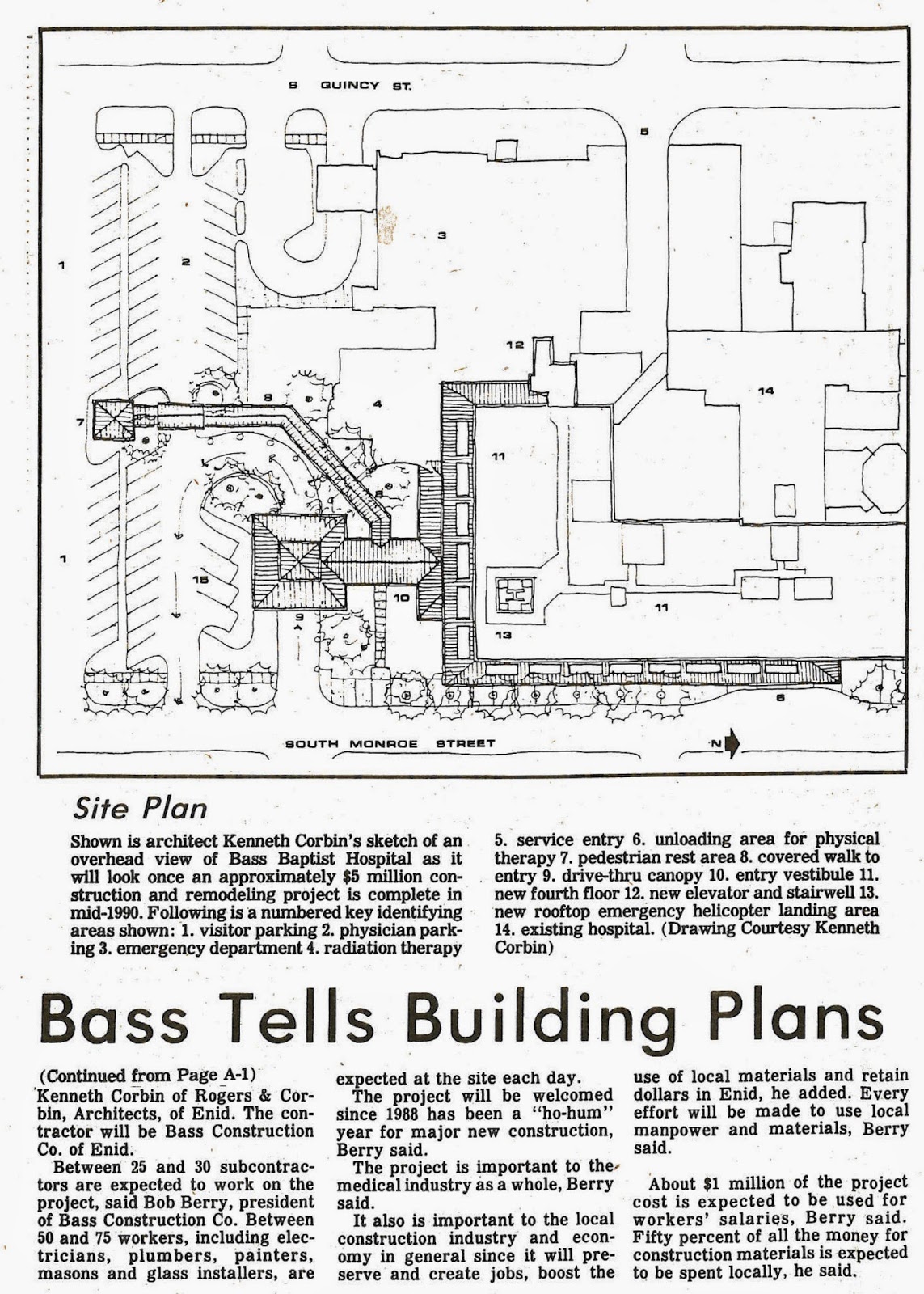
We recently went through an entire file drawer--3-1/2  feet of paper in horizontal files--devoted to one project--the addition of a fourth floor to Bass Hospital.  The plan was designed to provide state-of-the-art surgery suites for the hospital.  We had saved much of the publicity devoted to the project, now known as Integris Bass Baptist Memorial Hospital.   The hand-drawn site plan below was completed before computer drafting was common, although we did have word processing using an early version of Microsoft Word.


Computer rendering capabilities were also non-existent, but most architects were skilled in drawing elevations by hand.  The colored pencil rendering by architect Ken Corbin is recognizable as the south elevation of Integris.  The metal canopy was planned to provide a graceful transition from the 3-story building to the 4th floor addition, but also serves to provide shade and protection from inclement weather. 


While we are at it, why not add a helicopter landing pad on the roof?  As the Integris publicity below makes clear, a rooftop heliport is a definite advantage when critical care is necessary in medical emergencies.


In the Enid News & Eagle photo below, Dr. Eugene Baxter, then Bass Memorial Baptist Hospital administrator, pictured with architect Ken Corbin, shows community leaders the floor plan of the fourth floor addition.  In the article, contractor Bob Berry of Bass Construction extolls the advantages of using local contractors who in turn use local sub-contractors, thus benefiting the local economy.


One of the most noticeable changes to the appearance of the hospital (aside from the addition of a whole floor!) is the beautiful precast concrete wall panels with  inset windows.  The windows, designed by Ken Corbin, were fabricated with the help of Industrial Materials, a local firm.  The photo below shows Bass Construction workers carefully hoisting the panels, each weighing over 10,000 pounds, according to the article.  The second picture, showing a window up close, also shows the process of making the final color selections as well as the details of the window wall.


Thursday, May 22, 2014

Leonardo's


What is more fun than tinkering with real tools in a well equipped workshop? Visit Leonardo's Children's Museum to see the newest exhibit designed by architect John Merz of Corbin & Merz Architects. Intern architect Kingkini Arend had a hand in making this exhibit the showpiece of the main floor by showing some real creativity in coming up with the concept for the tinkering sign that was fabricated by Henson Construction Company.  Intern architect John Arend also contributed to the functional creativity that makes this exhibit a popular stop for museum visitors.


John Merz, John Arend and interior designer Erin Haney play with the magnetic galvanized metal pegboard wall, arranging plumbing pipes and other component parts into kinetic abstract art.


Kids play with real tools at the fully functional workbench.  The Craftsman cabinets, laminated butcher block top, vise, and tools that hang on the pegboard wall are all the real deal, and any professional carpenter would love this setup!


Erin Haney, John Merz, Kingkini Arend, and John Arend of Corbin & Merz Architects are all smiles after giving the construction work on the Tinkering Exhibit at Leonardo's Children's Museum a thorough final inspection.  It all works! 

Friday, October 25, 2013

Farewell to the Broadway Tower

Corbin & Merz Architects recently moved to a new office on the mezzanine of the Hiland  Tower in downtown Enid.  We love it, although we are not completely unpacked, no pictures  of our work are hung yet; heck, we haven't even hung our certificates and licenses yet.  Rest assured they are right there in a box by the door if anyone needs to see them.  We are waiting until the two big pieces of green stained glass are hung in the reception area and the 12-foot ladder needed to reach the custom-made oak brackets the glass will hang from is returned to the building maintenance guys at Hiland.  Then we will hang stuff that might get knocked down or broken while folding and carrying out the ladder.

Pictured here is our old office that was on the fourth floor of the Broadway Tower.  The green, pink, purple and aqua glass is just visible behind the pottery vase holding the yucca pods on our reception counter.  They are on long-term loan from a friend who kept them under her bed until she realized the aqua color matches our conference chairs, and we might actually have a place to use them for decoration. In the old office they were hung from old iron hay loft fixtures scavenged from an old barn near Carrier, Oklahoma.  This space was gutted when we first rented it in 1993 and we kept the concrete deck as our ceiling.  Even the ceiling tile sales representative  liked the loft style atmosphere it gave to our office. 

 
        The Former Office of  Corbin & Merz Architects,
           back when we were known as Corbin Associates.


We built the glass block wall that defined a small conference area by ourselves, had a few gyp board partitions put in by Bass Construction Company, installed carpet and decided that was all we needed.  We used the left-over glass blocks as bookends.  Many of the plants you see in the picture are congratulation gifts from our friends and clients.

The very best thing about this office was the wonderful windows and views we had of downtown and of David Allen Ballpark that was designed by Corbin Associates, as we were known then.  We could even read the scoreboard!  We also had an excellent view of the elevators,  great landmarks that speak to the heritage of the City of Enid, and when the sunset lit them up in pink and orange, they were absolutely glorious.  We witnessed many beautiful sunsets and even rainbows from these windows.  In fact, the evening of the day we moved in, doing all the labor ourselves--we didn't have a whole lot of stuff--we were finally sitting down and resting, having an enforced break caused by a light rain shower, and we looked out these windows in the photo and there was a big, beautiful, full-arch rainbow!  We knew it was there for us, and we were so elated and happy and hopeful, and yes, everything did turn out well for us. 

John Merz became a partner in the firm. The Broadway Tower was purchased by a new owner and is now in the process of being transformed into a boutique hotel.  We subsequently moved to the Hiland Tower just a few blocks away, and when the green glass is finally hung up again and the certificates and licenses are back up on the wall, our new office will be complete.


Thursday, August 8, 2013

A Proposal for Stage Center

We have been reading about Stage Center in Oklahoma City and how its days are numbered as the site is being looked at as a location for a new office tower.  We have always liked the building and appreciated the fact that it is a piece of sculpture as well as a building.  We attended plays there in years past--"Quilters" was one of our favorites, but recently, we just park, get out and walk around, marveling at the multicolored boxes, tubes and ramps all connected like a great big tinker-toy construction and it suddenly occurred to us that the perfect use for this building would be a museum for tinker-toys and other construction toys--Lincoln Logs, Erector sets and those Frank Lloyd Wright blocks among others.

Photo credit: Lynne Rostochil

There are people who are always building grandiose and imaginative constructions with these toys and then discover they have no room to store them and they can't bear to tear it down, or their Mom or wife insists that they get rid of the huge wobbly thing because they need the den for the garden club meeting or the back bedroom for the daughter moving back in after her divorce.  The Construction Toys Museum is a place they could call and donate the thing to them for display. Win-win for everyone! 


Seriously, classic toys are collectible and the construction toys are some of the most loved, most collected and cherished of all toys, and one of the most creative and versatile, too.  There are already museums featuring these classics, but none of them look like they were built out of a great big set of construction blocks.  Oklahoma City could have the premier construction toy museum in the whole wide world!


Besides the Lincoln Logs and Erector Sets, there are Legos, ABC blocks of all kinds, construction blocks with rectangles, arches and columns, castle blocks and the Construx sets.  Vintage sets are available as well as brand-new versions of the classic toys.  Displays could include some of the fantastic and outlandishly large constructions, there could be playrooms where kids could build stuff, contests could be sponsored to encourage creative competition. The history and stories of the creators and inventors could be featured in films or display backdrops.


How cool would it be to re-purpose this building for something that would enhance Oklahoma City's already growing reputation as a family-friendly, fun-loving destination?